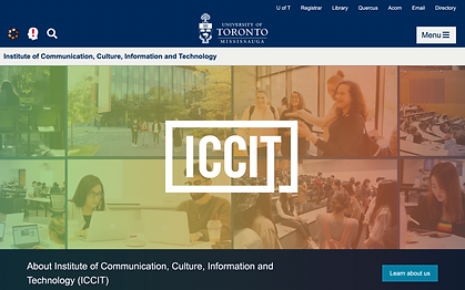
ICCIT Department Website Redesign
UofT Human and Computer Interaction Professor Cosmin Munteanu chose a group of students to assess the usability of the 2020 edition of the ICCIT Department Website, and to produce a website iteration to present to the department's directors and stakeholders.
The current design of the ICCIT Website incorporates features of this iteration. As one of the chosen students, I acted as the lead UX Researcher, notetaker and interviewer.
Project Brief
The University of Toronto Mississauga’s Institute of Communication, Culture, Information and Technology wanted a group of students to ideate a prototype to optimize the webpage of the ICCIT Program.
The team built a questionnaire for 21 participants to interact with the ICCIT Webpages, in order to identify the problem. All participants were first or upper year students at the University of Toronto, Mississauga, majoring or looking to specialize in one of the programs of the ICCIT department.
design steps
Observation
Prototype
Integration
Ideation
Feedback
Application
Step 1: Preliminary Research
Example tasks and questions
01
Access the programs' tabs and navigate through different categories
03
Find relevant information for a first year student
05
Does the image grid provide relevant information to the titles?
02
Find the certificate of Digital Media
04
Does the carousel offer new information?
06
What type of information would you like to find here?
- Users found that the information was not easily visible and well organized.
- They identified three different navigation bars and mentioned that the cluster of images obstructed functionality.
- Users unfamiliar with the programs found the terminology confusing.
Step 2: Designing for User Requirements
01.
User Pain
Users had difficulties finding content relevant to their needs because some information is missing.
02.
User Pain
Users struggled to navigate the page because the information was not immediately visible and accessible.
03.
User Pain
The information was not well prioritized and categorized.
04.
User Pain
Some users found information they deemed unnecessary, particularly in the carousel design.
01.
Design Requirement
Adding a search tab that users can use to find the information they want and synthesizing the image cluster.
02.
Design Requirement
Change the navigation bar by reorganizing it accordingly, removing any redundant information and adding new categories.
03.
Design Requirement
To put the relevant information within common clusters and rename the categories that confuse users.
04.
Design Requirement
Create a single navigation tab and categorize the information.
pAIN pOINT
dESIGN soLUTION
Preliminary Idea to Simplify the Interface

Proposed Solution

Step 3: Testing and Design Questionnaire
Evaluation Protocol
Used for the first and second rounds of testing
01
Introduce users to the ICCIT Website, which aims to provide information on the interdisciplinary programs, student’s years of study, and sought-out opportunities.
03
In the consent form, users will agree to think aloud when executing tasks.
02
Inform that we will observe user’s interactions with our redesigned website and follow up with a brief interview.
04
Users are free to withdraw from the study and to take a break at any point.
Step 4: New Observations & Proposed Solutions
oPENING QUESTIONS
-
What is your program of study?
-
What is your year of study?
U1
3rd Year
DEM
U2
3rd Year
CCIT &
English
U3
3rd Year
DEM
U4
U5
U6
3rd Year
CCIT &
Mathematics
4th Year
CCIT &
Psychology
4th Year
CCIT & Applied
Statistics
Testing Results
It is important to note that U4 and U5 were part of the first round of testing (where they had issues similar to U1 and U2 in this round of testing)

Good
Average
Bad
Step 5: New Evaluation Based on Revised Prototype
Step 6: Proposed Solutions
Low fidelity prototype
fINAL HIGH FIDELITY PROTOTYPES


